Tom Kubinski Mary Albers www.sextonprinting.com
|
October 2006 TK's Korner
Picking the Right Paper If you are like Karen, you may be very confused on the differences between the introduction of foreign sheets versus our domestic sheets. Just what are you getting or giving up. What differences are there between them? What is the difference between Coated/Uncoated, Gloss/Dull/Matte/Velvet/Silk, Premium/#1/#2/#3 and how do you choose the right paper for each different subject/print project? What effect will one paper have versus another for the family that you are trying to create? Well those are all great questions and this issue just may help you decide which paper to choose for your next project. There are quite a few good tools available for your library that help guide you through these hard decisions. Each paper house puts out helpful guides that explain their papers specifics; IE Product name, Grade, Finish, Shade, Brightness, Opacity etc. Sexton Printing also hosted an excellent seminar entitled, "Taking the Mystery Out of Paper." In addition, I host an annual paper mill tour that really enlightens even the veteran print buyer/designer. With all that being said, I will try to give you some additional information that answers most of those questions. Yet, we must remember that each project is different and may require a new twist to our final decision. Also keep in mind that there are two main ingredients in printing; paper and ink. If we truly understand each, we then will be able to make better informed decisions and obtain the desired results not only for our clients, but our targeted audience. Please see Ink Tour issue for more info.
First, lets address Foreign vs. Domestic. At home we have all kinds of stringent requirements and quality standards that our papers must meet. OSHA also plays a big role in what each Mill must do in order to make paper, while the foreign ones don't have these. All of which makes them much cheaper in most cases. This has put enormous pressure on our domestic sheets to lower their costs any way they can and could be the reason for some of the quality differences that you may be noticing. Also, this is the reason for some mills closing or eliminating certain lines. At the Sexton Printing seminar, "Taking the Mystery Out of Paper," we handed out the following tools/guides and information:
Now lets move into how paper is made and each type's specifics. All coated paper is made from wood fiber. Yet, all wood fiber isn't created equal. The precise blend of fibers from hardwoods and softwoods make the pulp for high quality coated papers. High opacity is essential to a fine-coated printing paper. This comes from the addition of special and expensive pigments, (called opacifiers), to the pulp before it enters the paper machine. These fillers even out the areas of low opacity by filling in the voids between fibers in the base stock. This in turn increases the number of reflective surfaces that gives you a sheet with even brightness, uniform strength, high opacity and an astonishingly smooth surface. In addition, it is these areas of low opacity that undermine the readability and print contrast of the sheet.
Coatings are precisely formulated mixtures of calcium carbonate and clay suspended in a binder. It's job is to create a smooth, uniform surface across the sheet so light will reflect evenly and ink films will be uniform. It must be tight enough to hold ink out on the surface and just porous enough to allow ink to bind tightly to the surface of the sheet. Ink Hold Out is when the ink delivers the intense color, crisp detail, precise lines, sharp halftone dots at full intensity when it sits up on the paper surface, while still able to set up on the surface of the paper. Typically, Gloss finishes have the highest retained ink gloss, followed respectively by velvet, silk and matte finishes. The process of calendaring is where the sheet/coating is polished to the desired effect/outcome. It is much like when you apply shoe polish. It is there and if you were to touch/scuff it, a shinny area would appear. Once the whole shoe has been polished, you end up with a high gloss. So the amount of production steps that your piece goes through, whether or not you apply a varnish/aqueous etc to the sheet will dictate what happens to your finished piece. Smoothness plays a key factor in print quality and light reflection. The smoother the sheet is, the better the reflection.
With all that being said, what does it mean? Listed below may help guide you.
Technical-Incredibly precise halftone dot; small pigments aligned for uniform light reflectance and excellent clarity.Velvet-is a lightly calendered surface that offers low to moderate paper gloss. Coating pigments and binders are combined to create a surface that scatters light. The velvet surface is best for printing images that need high resolution without high gloss. Velvet also provides high readability, premium performance and a tactile feel. Keep in mind that it may scratch N scuff if not coated. Attributes: Technical-More precise halftone dot than matte; greater light-scatter controlSilk-is a soft-finished surface with moderate paper gloss. Coating pigments are oriented so that light scatter is controlled. Silk is best for printing subjects that have a tactile sense, such as fine fabrics, and require high resolution without high gloss, such as a gem set in gold. Silk also allow for smooth, flat, solid ink lay and excellent readability. Keep in mind that it may scratch N scuff if not coated. Attributes: Technical-Precise halftone dot: controlled pigments like gloss but finished differently for softer resolution.Matte-is a smooth, level surface that's not supercalendered, so it scatters light and retains a sof t, "toothy" feel. It offers a look and feel of uncoated with the print reproduction quality of a coated sheet. Keep in mind that it may scratch N scuff if not coated. NOTE, I have found that running a matte/dull stock with a satin aqueous seals, protects the sheet and allows you to write on it. Ideal for direct mail with BRC's etc. Attributes: Technical-Less precise halftone dot; disoriented pigments scatter light for softer feelWow, that is a lot to absorb. No pun intended. Ok, you got me. I totally planned that. If you would like me to sit down with you on your next project to see what type of stock would make the most sense, how it plays into the family etc. just let me know. There are quite a few good tools available for your library that help guide you through these hard decisions. Yet, with all the changes that are occurring in the marketplace right now, I am not sure if or for how much longer.
Referrals are greatly appreciated. If you know someone who I should contact, please let me know.
If you would like to join me on one of our upcoming tours, if there is something that you would like me to address, or if you know of someone who might like to receive TK's Korner, please let me know via e-mail at tkubinski@sextonprinting.com or phone. Successfully, |


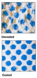
 Uncoated base stock has what is called an "open surface" that makes it ready-made for soaking up liquids or its porosity (a measurement that refers to the ease with which air passes through paper). The most noticeable negative, is that colors wash out and details lose their sharpness. In general, Uncoated paper is highly porous and is why it's often used for "soft" reproduction, such as watercolors, illustrations and copy.
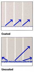
 Reflection or how light bounces off the surface back to your eye is dependant on the type of surface you have. A coated/smooth paper reflects light evenly in the same direction and enhances crisp reproduction. Uncoated paper such as non-gloss, mattes etc diffuse the light by scattering the rays in different directions. Typically, gloss has the best reflection, brighter color and snap with clear detail, followed by velvet, silk and matte.